Hey Look - blog header

Showing posts with label Color inspiration. Show all posts
5

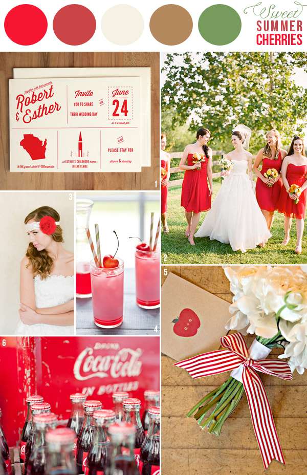
COLOR INSPIRATION: SUMMER REDS


Image credits: 1 - 2 - 3 - 4 - 5 - 6
377

COLOR LOVES - NAVY

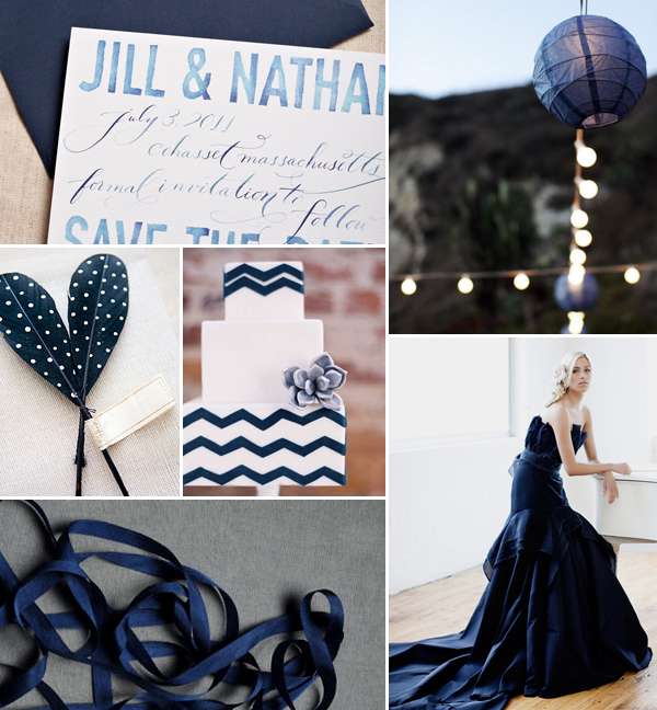
We love navy - it's elegant, understated and can be combined with almost any color. If you want to go for the pure navy look and not pair it with strong other colors, you can go for a combination of navy and white (nautical, simple, classic), navy and grays (elegant & classic) or add tones of browns, beiges and sand (natural, rustic but classy).

Rakastamme tummansinistä – se on elegantti, vähäeleinen ja voidaan yhdistää lähes minkä tahansa värin kanssa. Jos haluat täysin tummansiniseen keskittyvän värimaailman, ilman voimakkaita värejä, yhdistele seuraavasti: tummansininen + valkoinen (merihenkinen, simppeli ja klassinen), tummansininen + harmaan -sävyt (elegantti ja klassinen) tai lisää hiekan, ruskean ja beigen sävyjä tummansiniseen (luonnollinen, rustiikkinen, mutta klassinen).


Images: water color save the date, lanterns, feathers, cake, wedding dress, ribbon


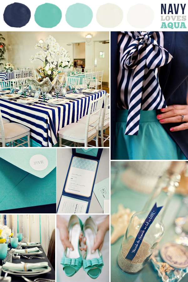
Navy gets a fresh look by combining it with aqua, teal and mint tones. Add some sandy shades & whites and you have the perfect color scheme for a beachy, summer wedding. If you want to go for a more fun and cheerful scheme, add pops of yellow to the palette - check out this shoot for inspiration. You could also combine the navy and aqua palette with shades of hot pink or coral for a preppy and modern look.

Tummansininen saa raikkaan ilmeen kun se yhdistetään aquan ja mintun sävyihin. Lisää hiekan sävyjä & valkoista ja saat täydellisen väriyhdistelmän rantahenkisiin kesähäihin. Jos haluat tehdä paletista hauskemman, lisää hieman keltaista. Voit myös lisätä palettiin hieman pinkkiä ja korallin sävyjä luodaksesi preppymäisen ja modernimman lookin.


Images: table setting, outfit, stationery, table setting 2, aqua shoes, bottle favor


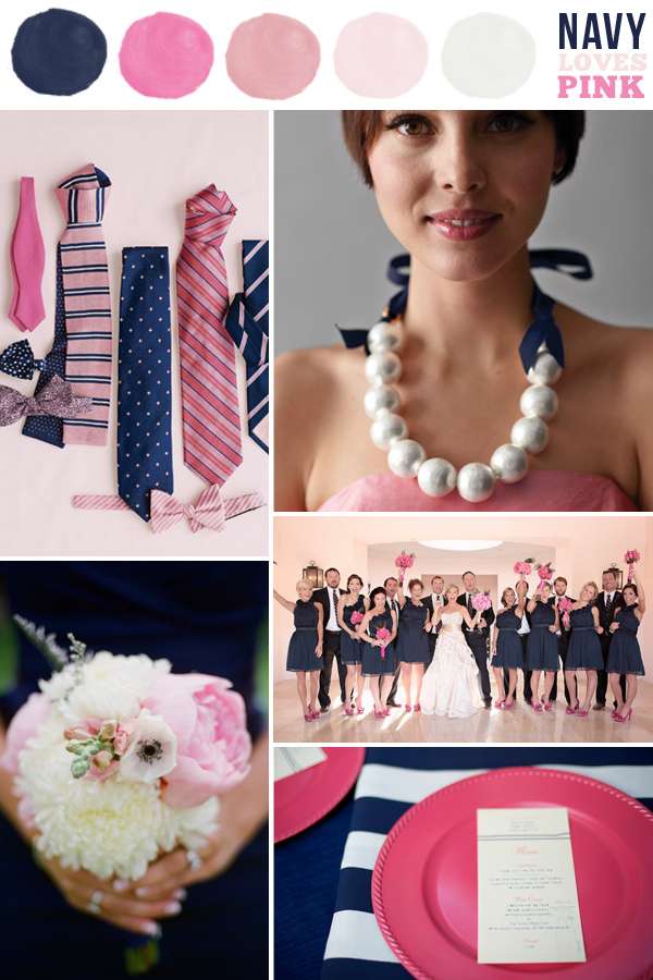
If you like it preppy, navy combined with pinks and blush tones might be your perfect color palette. Leave out hot pinks and go for only soft blush tones to get a more classy and elegant look. Add some striped patterned fabrics and you've got a beautiful but fun nautical theme. Another lovely preppy color scheme is navy + white + green - check out these bridesmaids' outfits for inspiration.

Jos pidät preppy-lookista, tummansininen yhdistettynä pinkkiin voi olla täydellinen väripaletti sinulle. Jätä pinkki pois ja yhdistele pelkästään vaaleita ja pehmeitä punan -sävyjä saadaksesi elegantimman ja klassisemman lookin. Lisää pinkkiin raidallisia ja pilkkullisia kuvioita saadaksesi merihenkisen kokonaisuuden.


Images: ties, bridesmaid, wedding party, bouquet, place setting


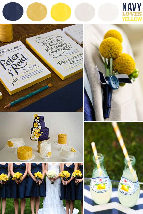
Navy, yellow + white is a lovely scheme for a spring or summer wedding or party, especially an outdoor one. It's not overly preppy, yet fun. It's bright and cheerful, yet classical. You can also add some beige and sand tones to give it a little rustic touch.

Tummansininen, keltainen + valkoinen on ihana väriyhdistelmä keväiseen tai kesäiseen hääjuhlaan, eteenkin ulkona pidettäviin juhliin. Yhdistelmä ei ole liian preppy, mutta kuitenkin hauska. Se on kirkas ja iloinen, kuitenkin klassinen. Voit lisätä beigeä tuomaan kokonaisuudesta hieman rustiikkisen.


Images: stationery, boutonniere, cakes, bride & bridesmaids, lemonade


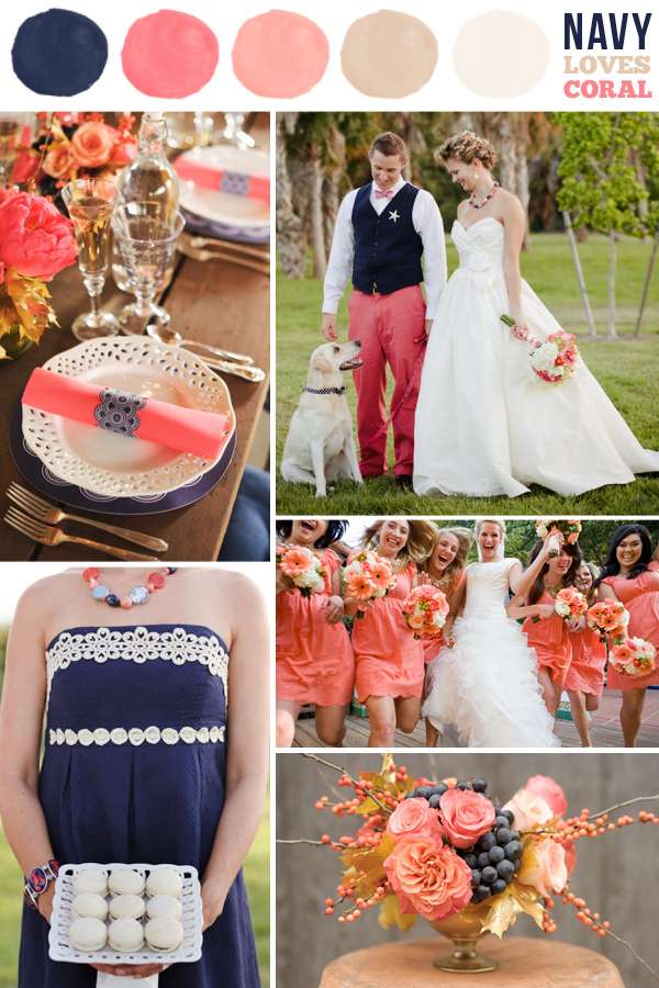
Coral and peach tones work beautifully with navy. You can go for a fresh setting of coral, navy and whites or give it a bit of a rustic & natural feel by pairing the color with beige and browns. We particularly love this inspiration shoot combining the color combo with a setting and brown & gold tones.

Korallin ja persikan sävyt toimivat kauniisti tummansinisen kanssa. Voit yhdistellä sävyt raikkaasti valkoisen kanssa tai tehdä yhdistelmästä hieman rustiikkisemman yhdistämällä palettiin beigeä ja ruskeaa. Koita myös yhdistelmään kultaista!


Images: table setting, bride & groom, bridesmaids, navy dress, floral arrangement


If you like this post, be sure to check out our other color loves posts on mint and tangerine!


15

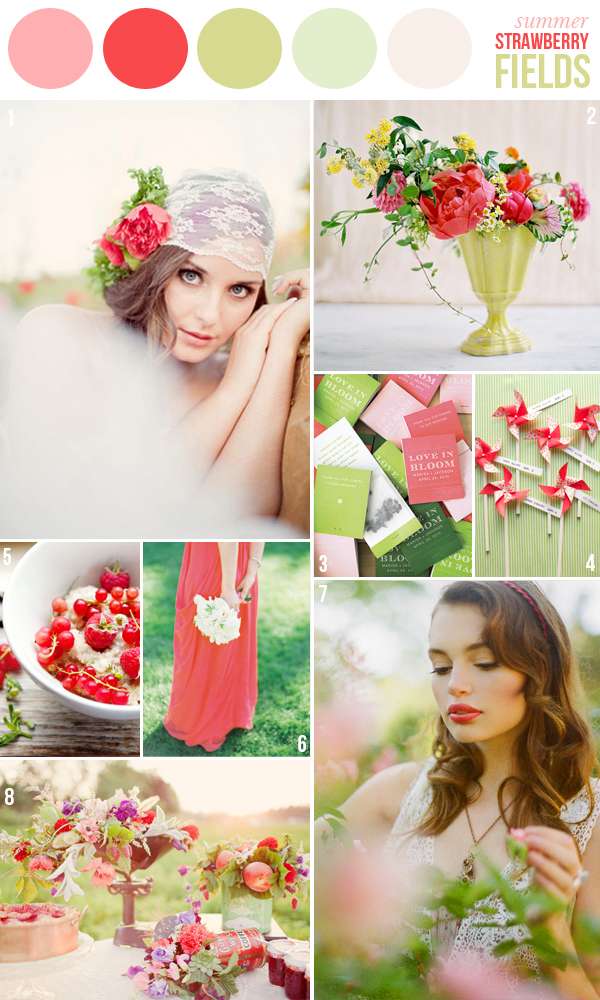
COLOR INSPIRATION: STRAWBERRY FIELDS


Credits: 1 - via Green Wedding Shoes, 2 - Amy Osaba florals on Jose Villa's Instagram, 3 - Martha Stewart Weddings, 4 - Oh Happy Day!, 5 - Cannelle et Vanille, 6 - , 7 - Ruche Lookbook (photography by Brandon Kidd), 8 - via Green Wedding Shoes


We're getting a fresh load of snow today, so we needed some cheering up. This bright and lovely inspiration board gets us in the mood for summer! How about you?

20

COLOR LOVES - MINT

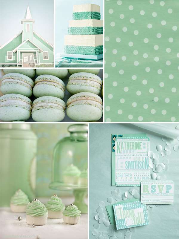
Today's color love feature is all about shades of mint and seafoam. It's such a versatile color that can be used in classical, cute and even preppy event designs. By itself mint is fresh and pretty, but chic at the same time. Pair it with lots of white for an extra fresh look.


[Images: mint building: Madden Photography, wedding cake: Martha Stewart Weddings, polka dot texture: Oilcloth, macarons: sfophoto on flickr, cupcakes: Sprinkle Bakes,  stationery: ]


If you want to go very classic, chic and elegant, pair off-shades of mint and seafoam with gold and neutral tones from cream over blush to beige and light brown. Add some very dark brown tones to give it a more masculin and dramatic touch.


This color palette works beautifully in either rustic environments like barns or in historical spaces with chandeliers, ornate ceilings and white walls.

[Images: wedding dress: Corbin Gurkin on Style Me Pretty, table setting: Enjoy Events via 100 Layer Cake, stationery: Gourmet Invitations featured on Style Me Pretty, wedding cake: Kristen Marie via Style Me Pretty, pinwheels: MadeULook Photography on Ruffled]


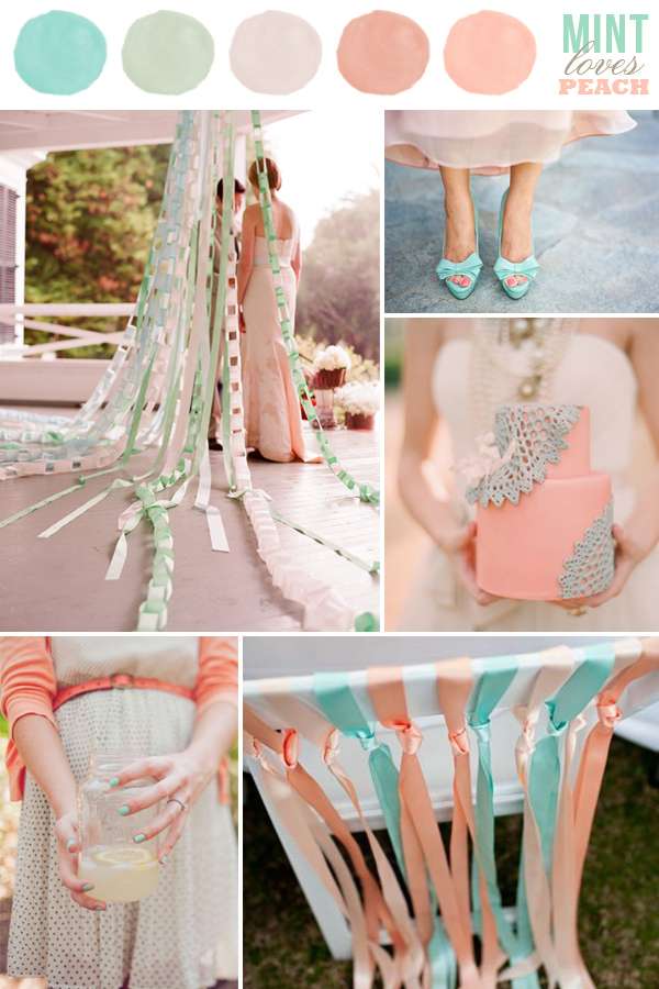
For a feminine and pretty look, pair shades of bright mint with peach and blush tones. The color combo is perfect for romantic summer weddings, bridal and baby showers. Don't you love how light and airy these colors look together?

If you like it preppier, replace the peach shades with strong coral tones + black and white.


[Images: paper chains: Kelly Oshiro, minty peep-toes: Corbin Gurkin on Style Me Pretty, wedding cake: Sweet And Saucy Shop, lemonade: Shipra Panosian on Style Me Pretty, chair & ribbons: Sutherland Covach on Style Me Pretty]


18

NEW FEATURE: COLOR LOVES - TANGERINE TANGO

Hello readers! It's been a bit quiet on the blog during the first week of 2012. Lotta was busy painting our new studio and I was super-busy taking in New York. If you plan on going and love event styling or decorating, buy the book "A stylist's guide to NYC". It's been serving me so well! Although make sure to look up the store and restaurant locations online before heading out, some of the places are not exactly where the book says.

Now that I'm back and got over my jetlag, I'll be posting a lot more again, so stay tuned. Today we're starting a new regular feature for all of you, who plan a wedding or a party or simply want some inspiration for re-decorating the home. Often we come across brides-to-be who want their wedding to be a certain color. One color. Because it's a color they love. In many cases, they tend to stick to just the one color, because they are not really certain which colors would complement the shade picked or what effect a 2nd and 3rd color added would have. We'd like to help with that. We'll be picking a shade regularly, show it by itself and combined with colors that match. If you have any requests for color features, a color you'd love to see combined with others, just shoot us an email or leave a comment under this post.

We're kicking off this feature with the pantone color of 2012: Tangerine Tango. A rich, vibrant orange that will add splashes of fresh color to any space or event.
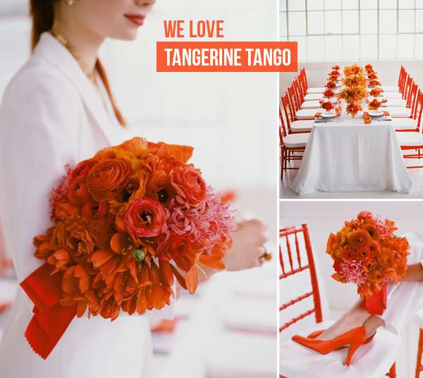


A rich tone of orange used in a clean white space makes for a fresh, stylish and modern setting. Combine tangerine tango with lighter, softer shades of orange and peach to tone down the effect a little.  If you're not lucky enough to have a space this bright white, you can also use it with brown woods or all shades of gray.

[images via Snippet & Ink, Floral Design by Ariella Chezar, Photography: Meg Smith]
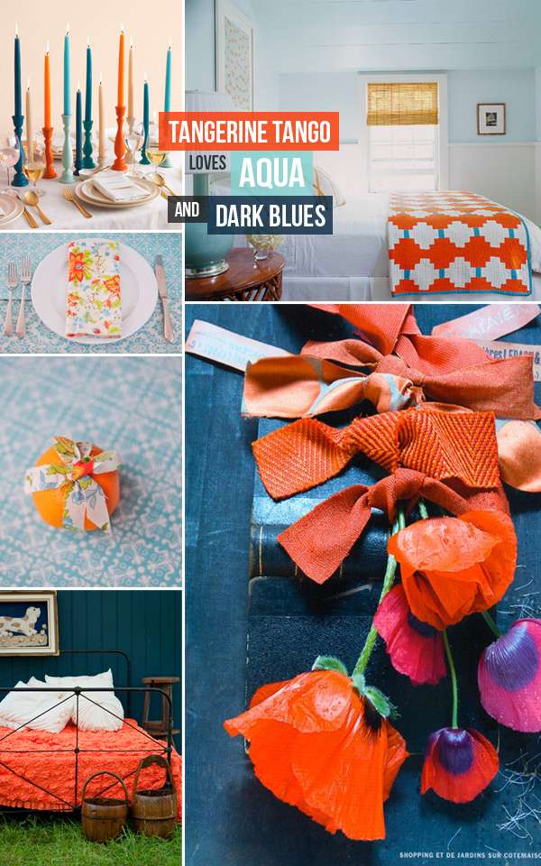


Shades of blue and aqua will really make tangerine pop. Use soft, light shades of aqua, turquoise or light blue as the base colors for your space and just add a few pops of tangerine. You'll have a lovely and balanced look perfect for spring and summer. You can add pops of yellow and even pink for a vibrant, fresh, summery event setting.

Add dark orange to dark hues of blue and the effect will be more dramatic and rich. Use sleek fabrics and clean surfaces to create a more elegant setting. Use this color combo for example in an old barn, add heavy woods, and you'll have a more rustic look.

[images: Candles via Martha Stewart, bedroom via xJavierx on flickr, aqua and mandarine table via Project Wedding, orange poppies by Côté Maison, orange quilt: ada & darcy]


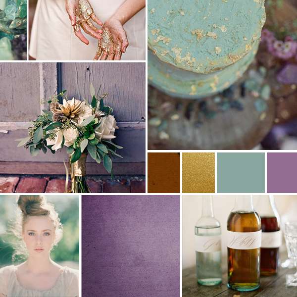
Tangerine goes great with all shades of purples and lilac. Combined with deep shades of purples, you can create a range of different settings: in elegant spaces with sleek fabrics or lace, you create a very dramatic, yet romantic effect. Use the color combo with more earthy materials, like clay, raw or vintage woods and you can create a folklore style setting or a fiesta style event.

Pops of tangerine on light or muted shades of lilac make for an unconventional, elegant setting. Perfect for (semi-)formal weddings

[images: top row via Project Wedding, lilacs and tangerine by Randi Brookman Harris for Martha Stewart, photography by Ditte Isager]


[Uuden Vuoden kunniaksi aloitamme uuden blogikategorian -Color Loves. Autamme yhdistämään tämän vuoden kuumimpia värejä eri väreihin. Vuoden yksi suurimmistä väritrendeistä on Pantone Tangerine Tango, yhdistä se veden- ja tummansinisiin sävyihin tai lilan eri sävyihin! Pysy mukana ja näe miten yhdistelet tämän vuoden värejä mielekkäästi saavuttaen erilaisia vaikutelmia!

Mikäli haluat ehdottaa meille värisävyjä, joita haluat nähdä tai sinulla on kysymyksiä väreistä, laita meille postia heylook@heylook.fi]

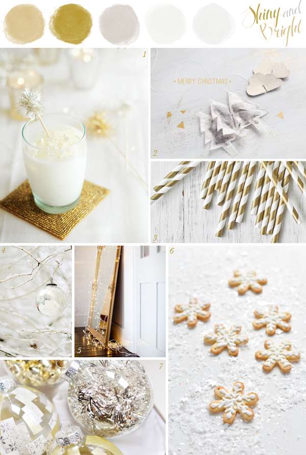
19

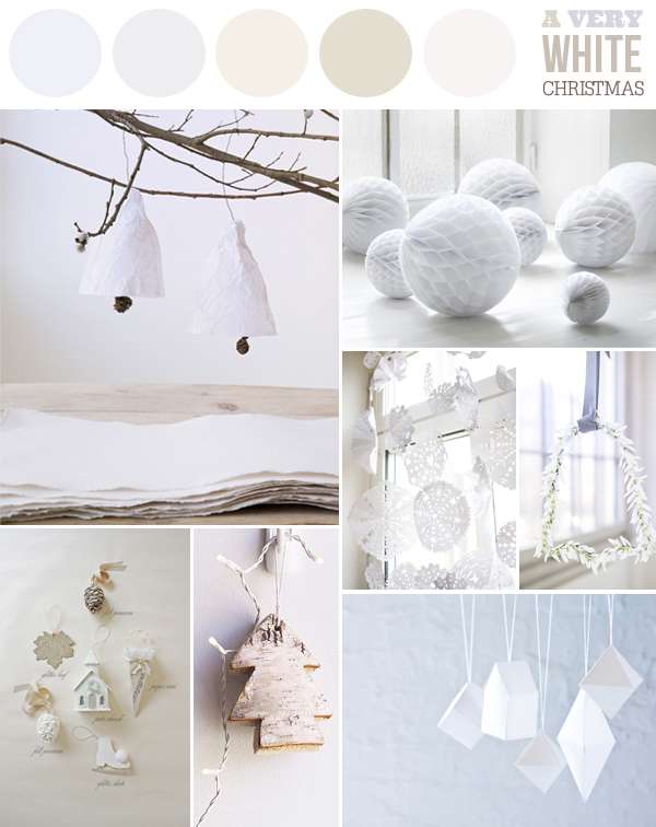
SIMPLE CHRISTMAS BOARD #4: WINTER WHITES


Credits: Paper bells and bell shaped wreath: Bolig Liv - Honey comb balls: Design Delicatessen - Simple paper snowflakes spotted on Fine Little Day - White ornaments: A Field Journal - birch tree ornament: Eat Drink Chic - DIY paper ornaments: Deko


230

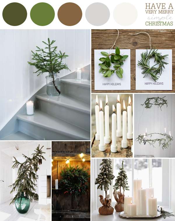
SIMPLE CHRISTMAS BOARD #3: WINTER GREENS


Credits: Mini christmas tree on the stairs: Hus & Hem, photography: Patrik Hagborg- Mini Wreath Holiday cards: Frolic! - Candles: Basic Label Sweden - Hanging wreath with candles: Johanna Vintage - Simple tree in large vase: Fryd og Design - Holiday wreath with red berries: Katy Elliott - Trees and candles by the window: BHG


12

SIMPLE CHRISTMAS BOARD #2: FESTIVE MONOCHROMES


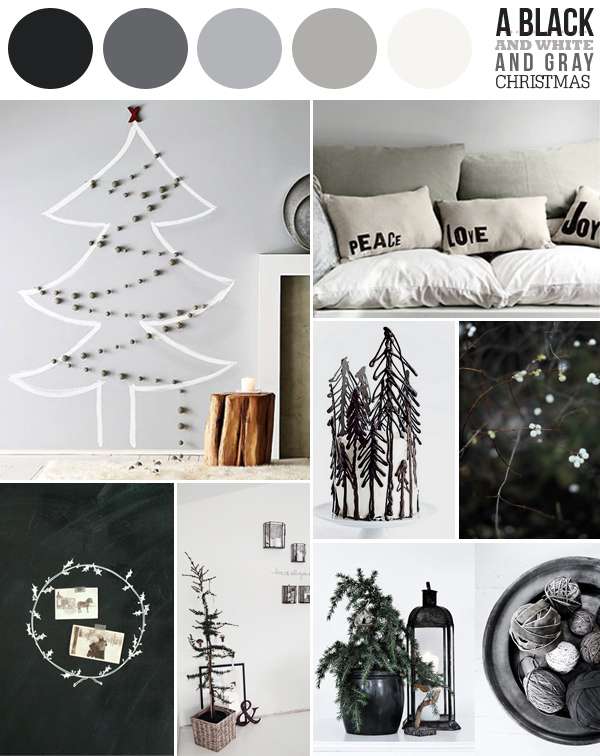
Credits:  Wall tree: West Elm via Sf Girl Bay - Peace Love Joy: Country living - Black forest cake: - What Katie Ate - Winter berries: Hey Look / Michaela - Chalkboard wreath: Shanna Murray - Tree in basket: Forever love - Lantern & bowl of ribbons: via Emmas Blog